When we first dreamt up the concept of Eaten we knew that the most important thing would be creating a platform that really worked for our users. From 100% crowdsourced data and proprietary algorithms to personalised filters, our users are front and center of everything we do here at Eaten.
So when we decided to implement our biggest app update to date, we knew that we had to run it past you first. For the last two months we’ve been asking you for your thoughts on what you love, what you don’t love and what you’d like to see more of in the app, and re-designed our interface based on your feedback.
You asked for…

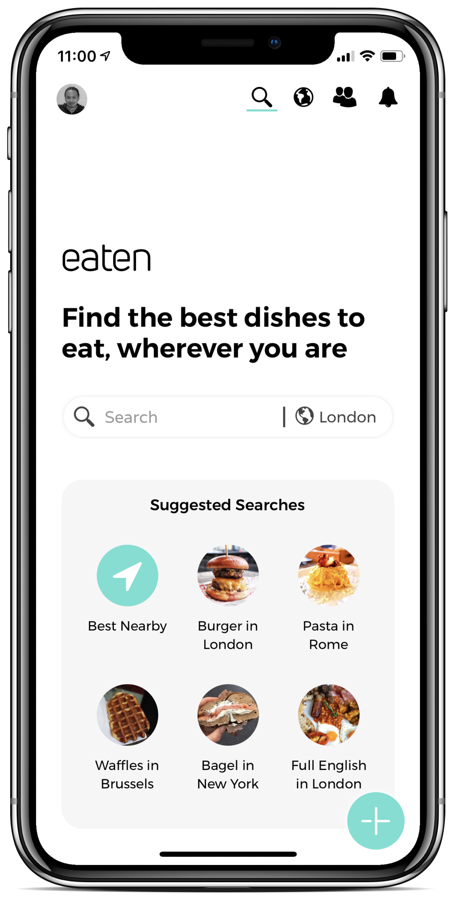
A quicker way to search
We have redesigned our homepage to contain a single ‘search’ bar, simplifying the process of searching for a certain food around you. We have also added helpful suggestions for when you’re looking for a bit of inspiration, and a ‘best nearby’ to automatically see the highest rated dishes in your area.
A simplification of
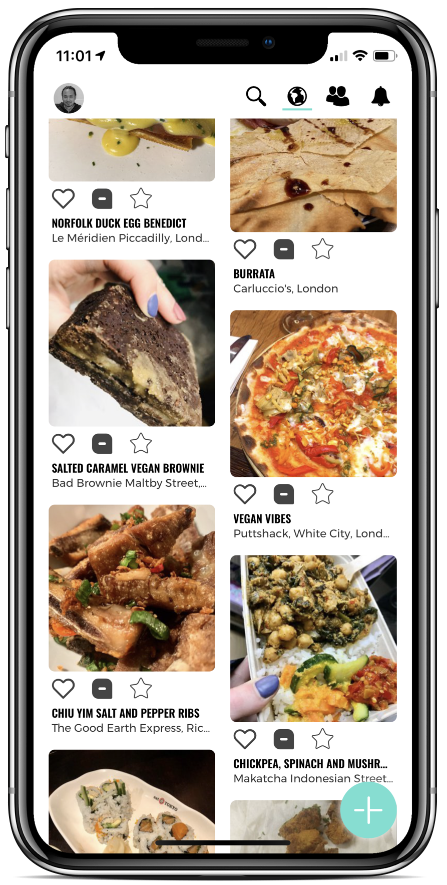
the explore page
Sometimes we know exactly what we want, and sometimes we need a little inspiration. Our explore page is designed to show you a snapshot of the most popular Eaten reviews from all around the world, tailored to your individual preferences. Reviews that are ‘trending’ will appear here, and the new layout makes it possible to search via location (perfect for foodie travel inspo!)


A greater sense of community
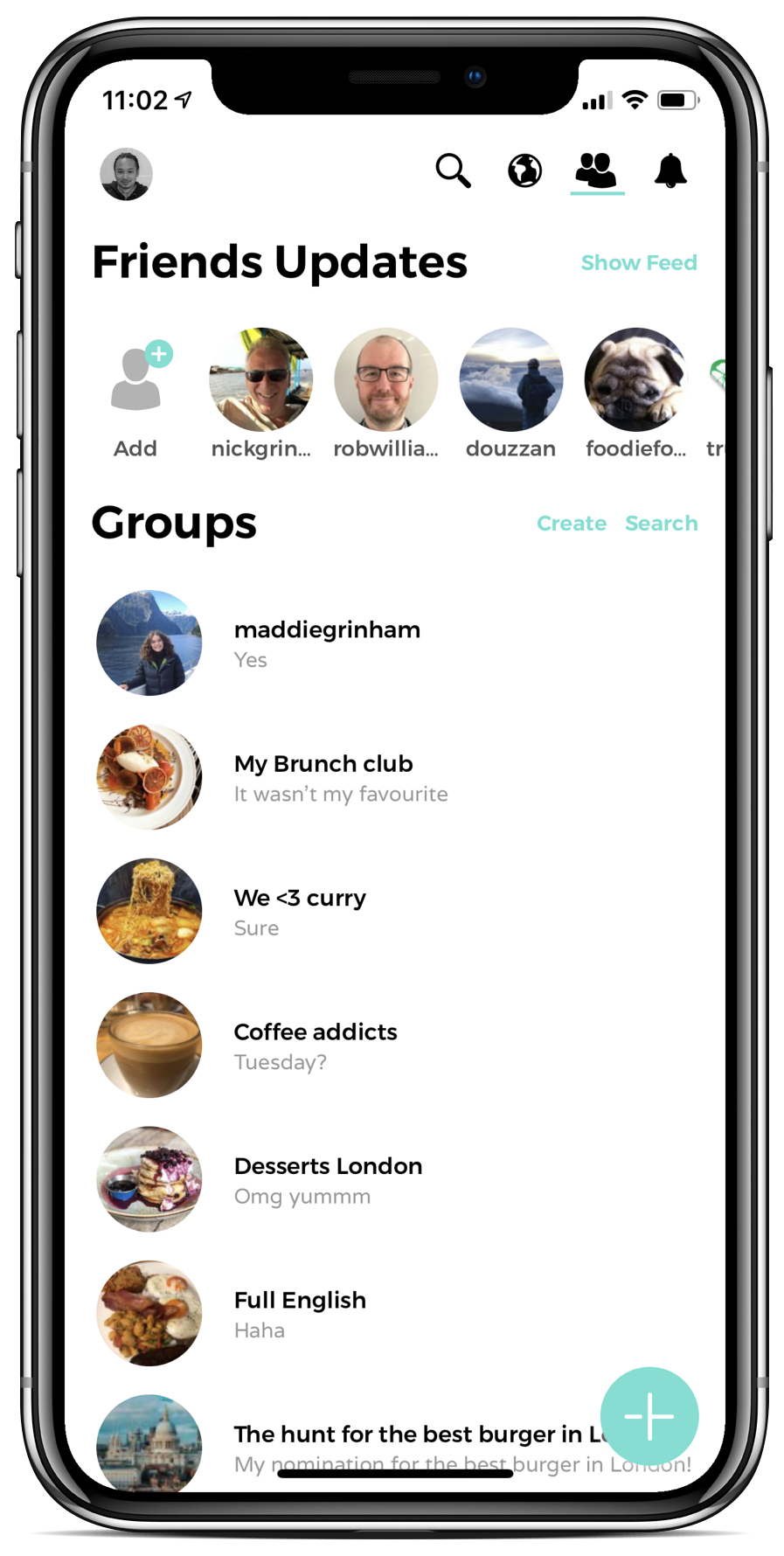
You told us that you loved following your friends on Eaten, and wanted a way to make the app more social. So we’ve created ‘Eaten groups’, a place for you and your friends to share your food adventures.
To do this, simply click the ‘create’ button to create a group and invite your friends to join you! Groups allow you to share pictures, discuss restaurants and even arrange meetups.
After all, food is better when shared with friends.
We hope you love our new app design as much as we do, and as always we would love to hear your feedback!